
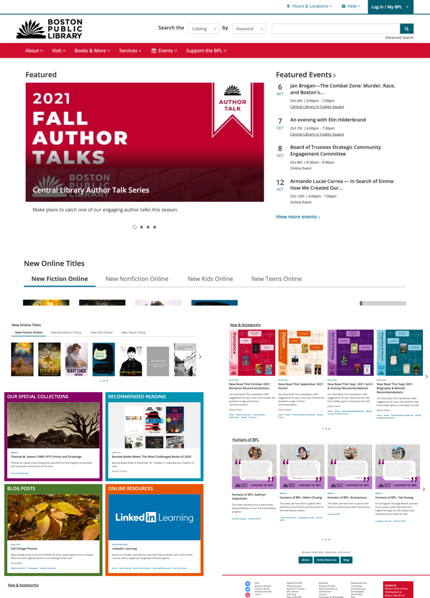
I do think there's something comforting about how most library websites look the same, but they can also be cluttered, outdated eyesores. BPL and other libraries build their website, catalog, calendar, and marketing using BiblioCommons' integrated suite of products. I'm sure it's robust and convenient to use, but the finished websites aren't as clean as their intended use.
Museum websites have undergone many changes and have established unique and even trendy identities through UI and graphic design; while maintaining robust research databases and online archives that are easy to use and frequently updated. This project is to imagine BPL working with designers to establish their voice and create a vivid, clear, and organized website.
Eventually, I might try to redesign BiblioCommons or make the designs below more flexible and accessible.
Design
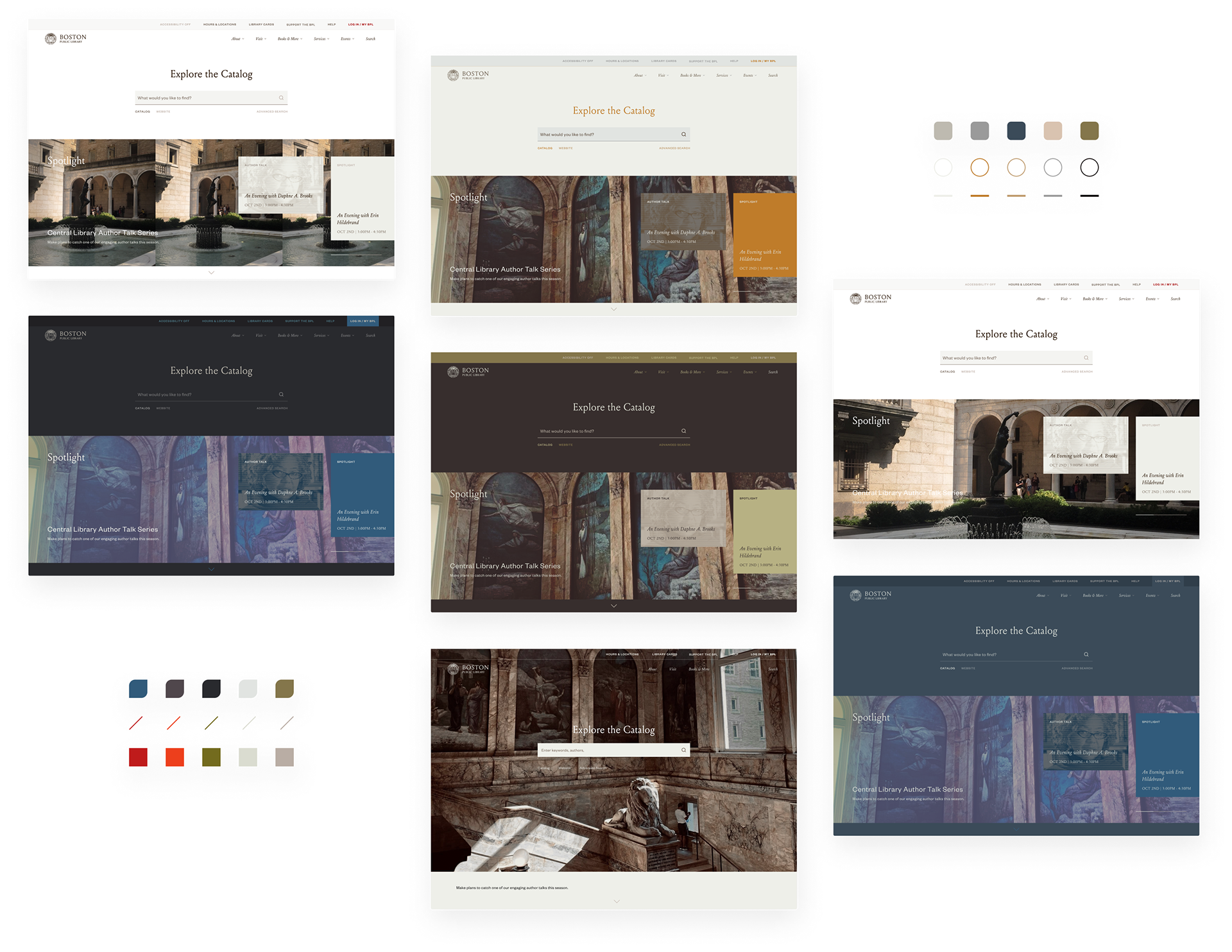
Home page and color exploration
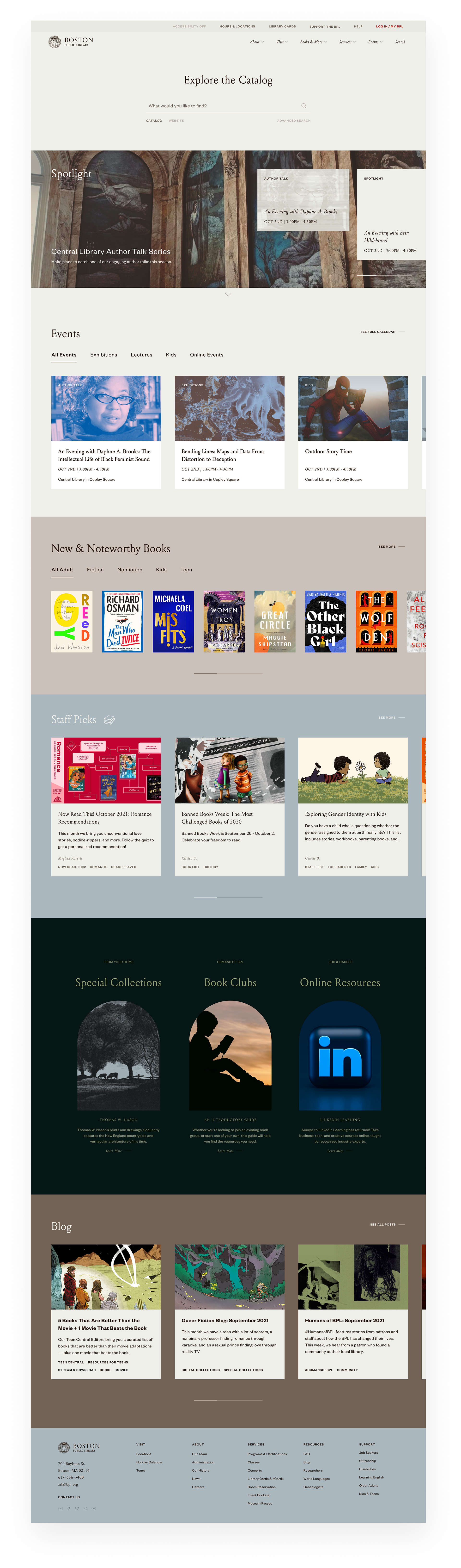
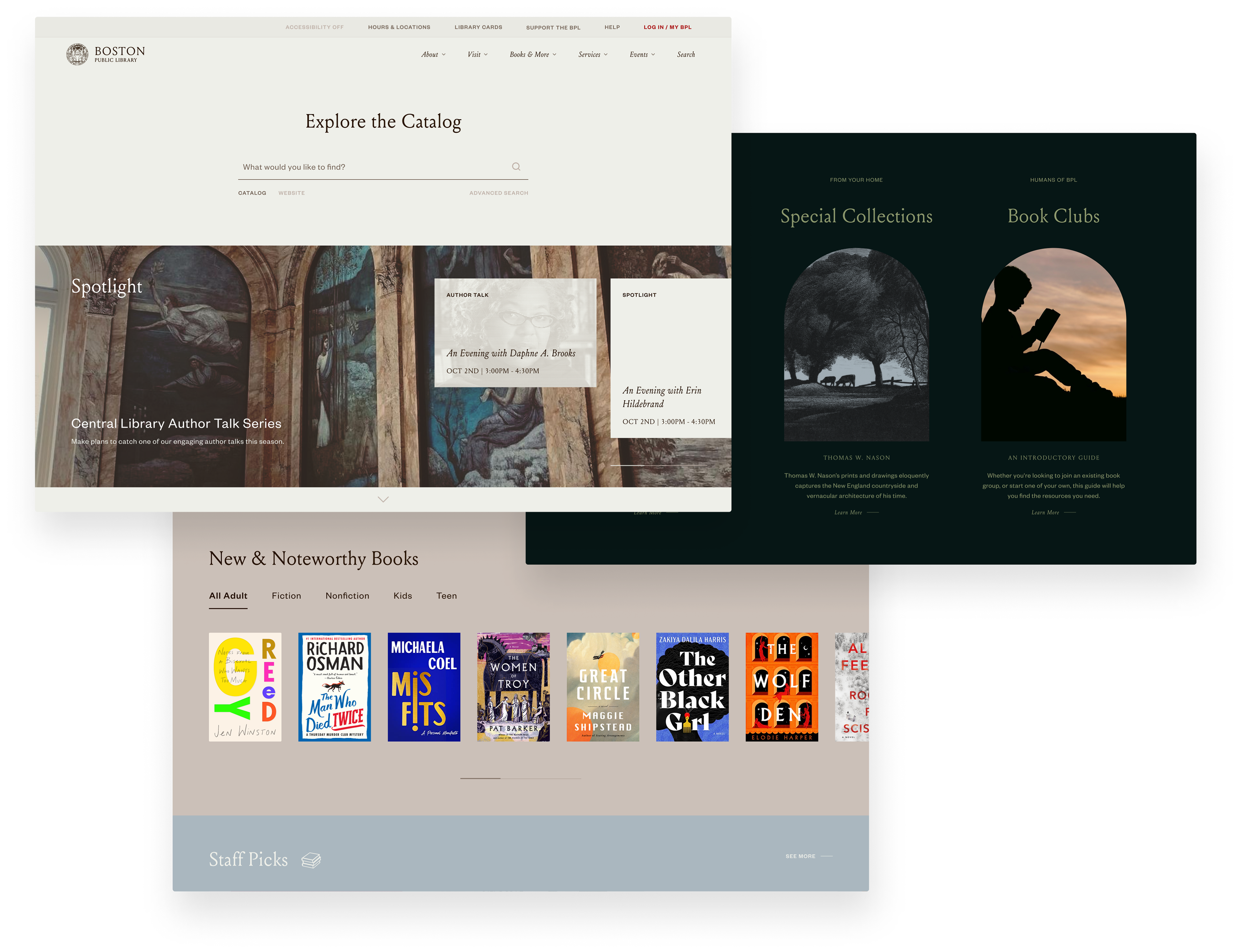
So far, this design employs a warm color palette, different fonts, custom collaged cover images or book cover art.
I switched up the order of the page and re-prioritized topics like resources and reading. Each topic has its own simplified section and place in navigation, so elements like book lists are together instead of being scattered throughout the page. Also, I replaced the BPL logo with something less clipart-y/generic—I think it would be nice to modernize their old crest or somehow call back to BPL's historical presence.