


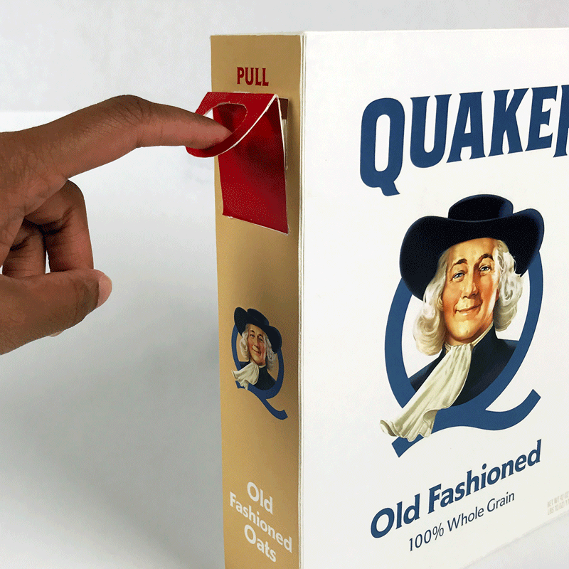
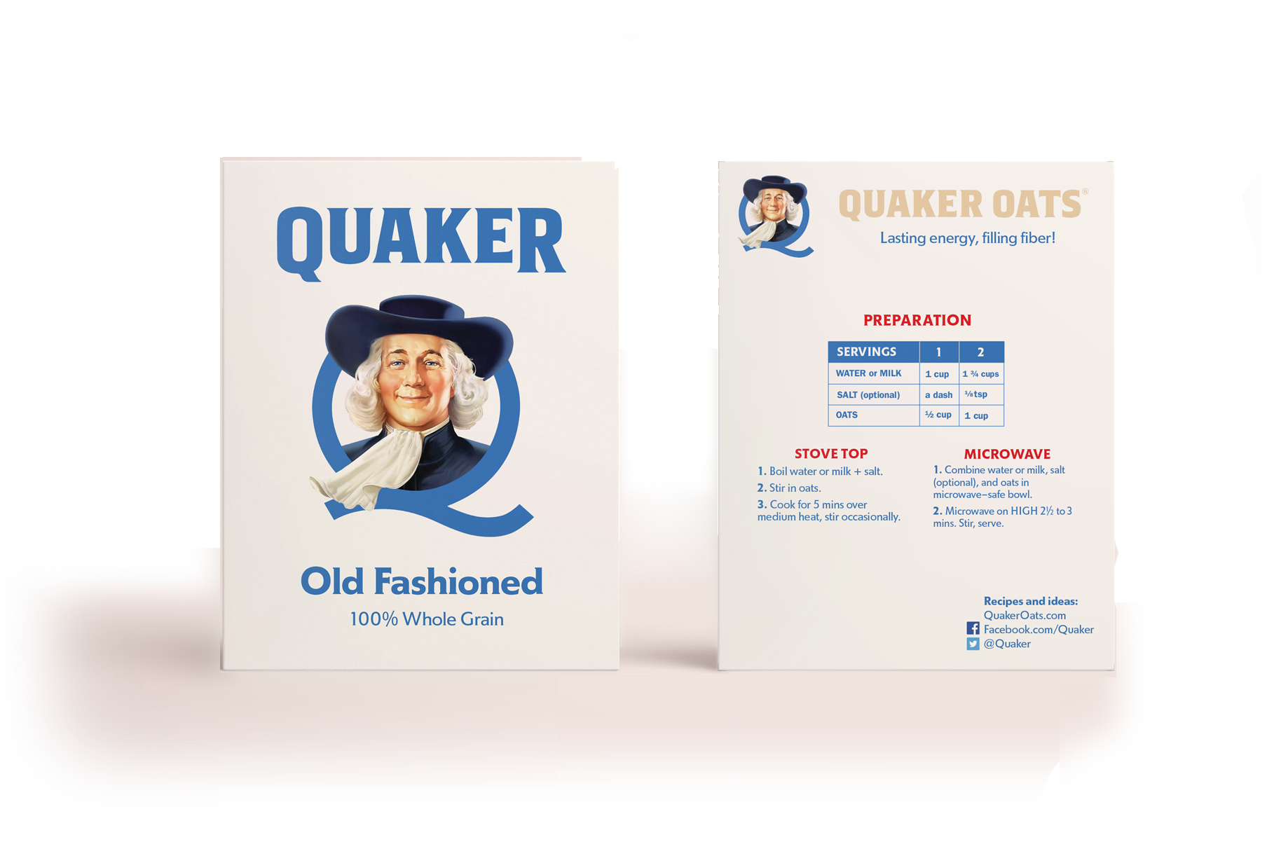
Loyal, lifelong customers don’t need gimmicky walls of text to convince them to buy a product, so I took it out.
This leaves room for bigger, higher-contrast text. Imo, Quaker has been moving away from their “classic” look on their other products anyway. I also made a more iconic, nostalgic, and “classic” version of the package, with the previous back or this variant red back.

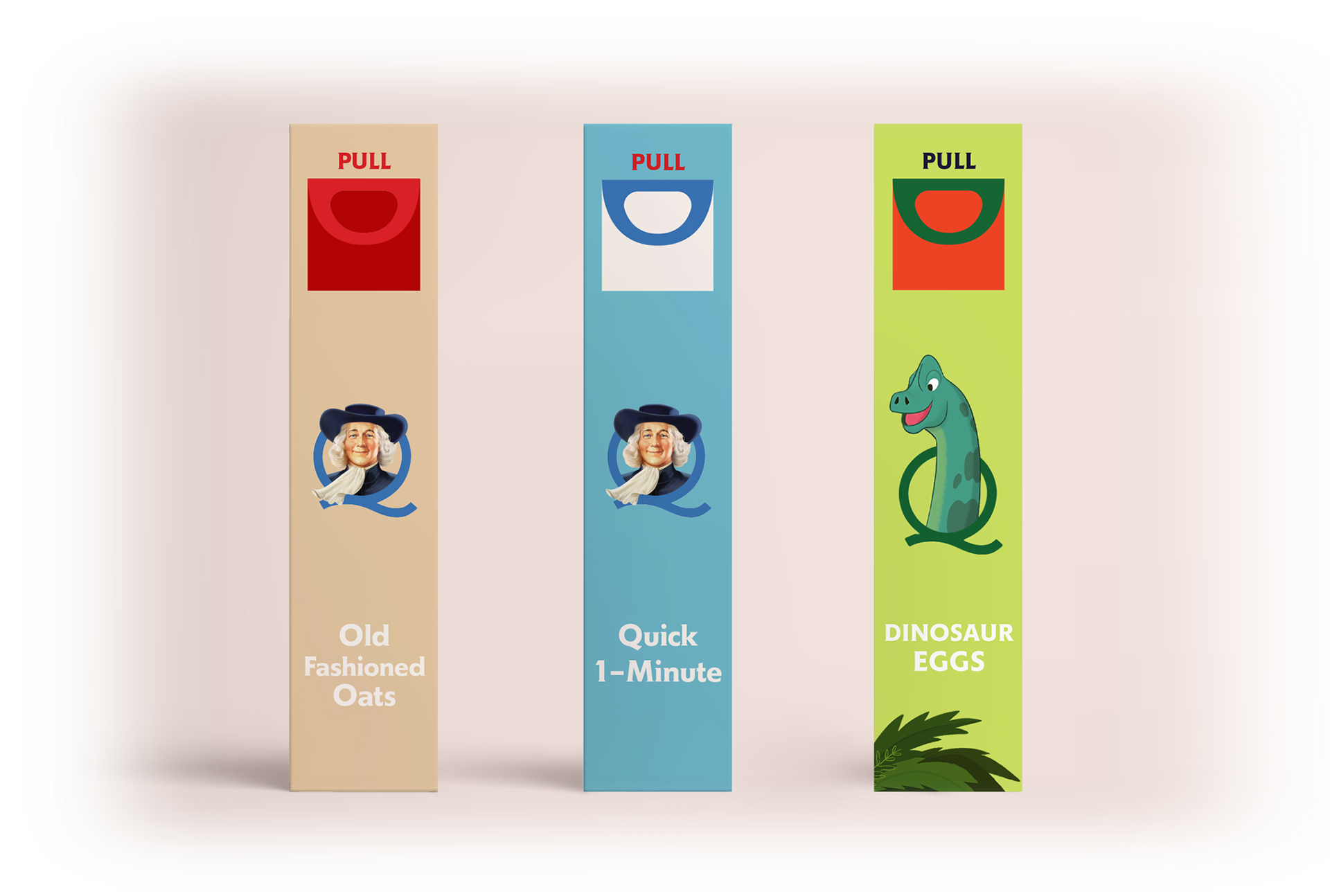
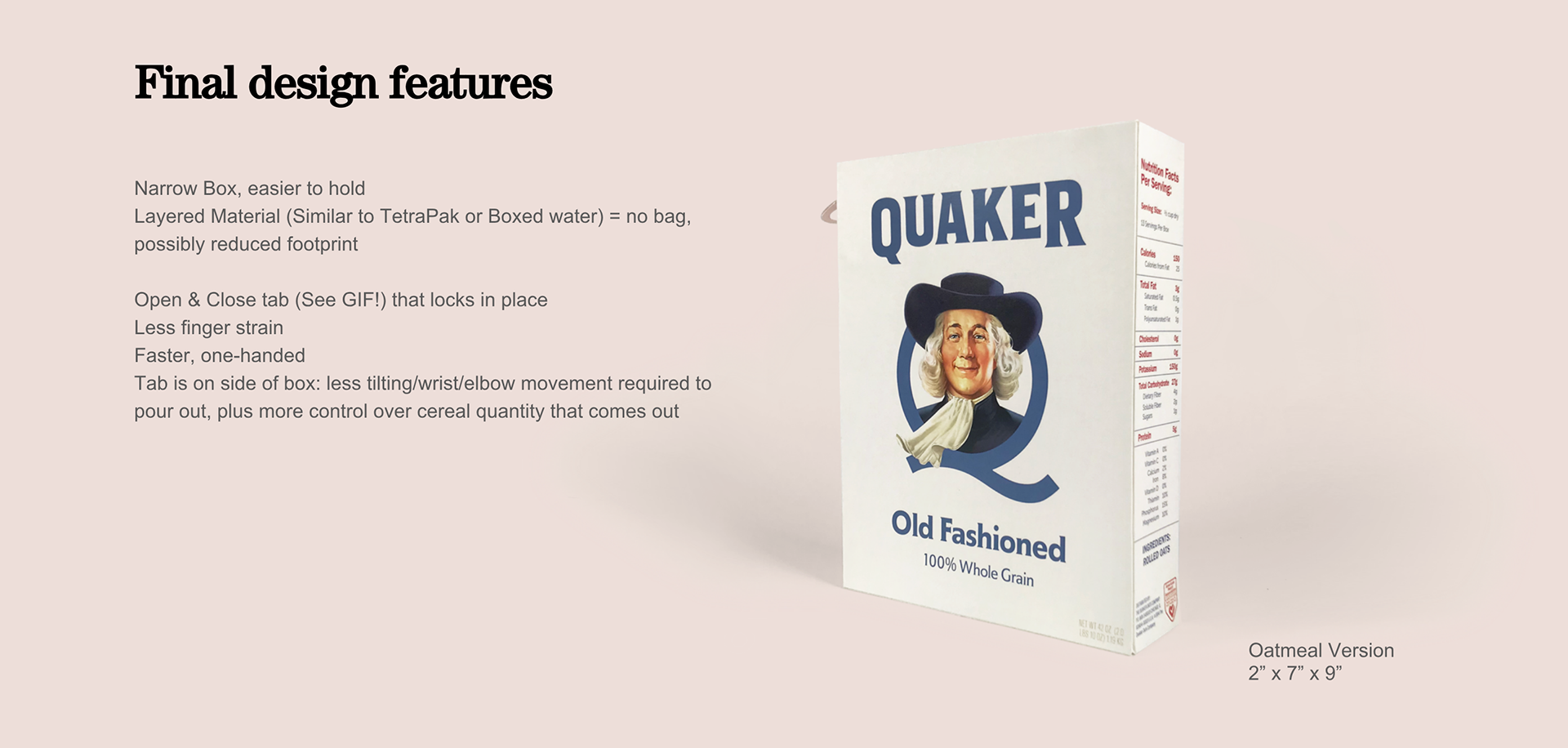
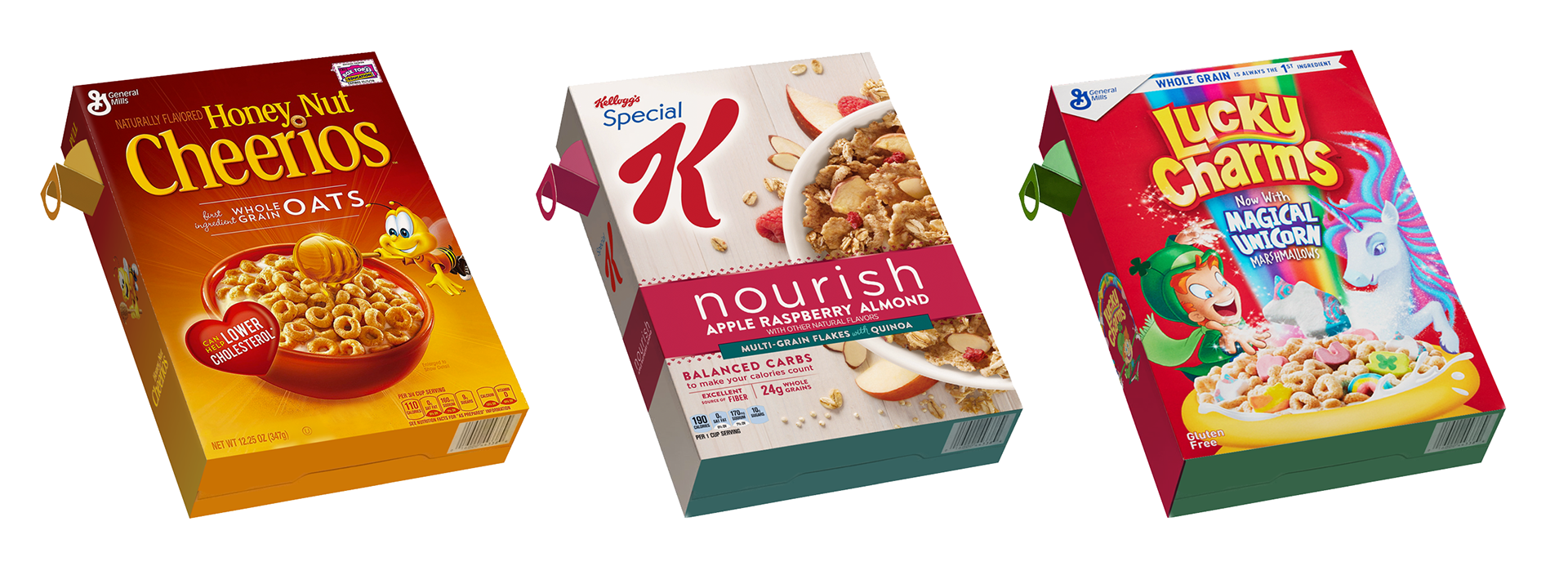
Cereals are now easy to distinguish by their sides, even if a bunch of them are crammed into a cupboard.
Thank you!