
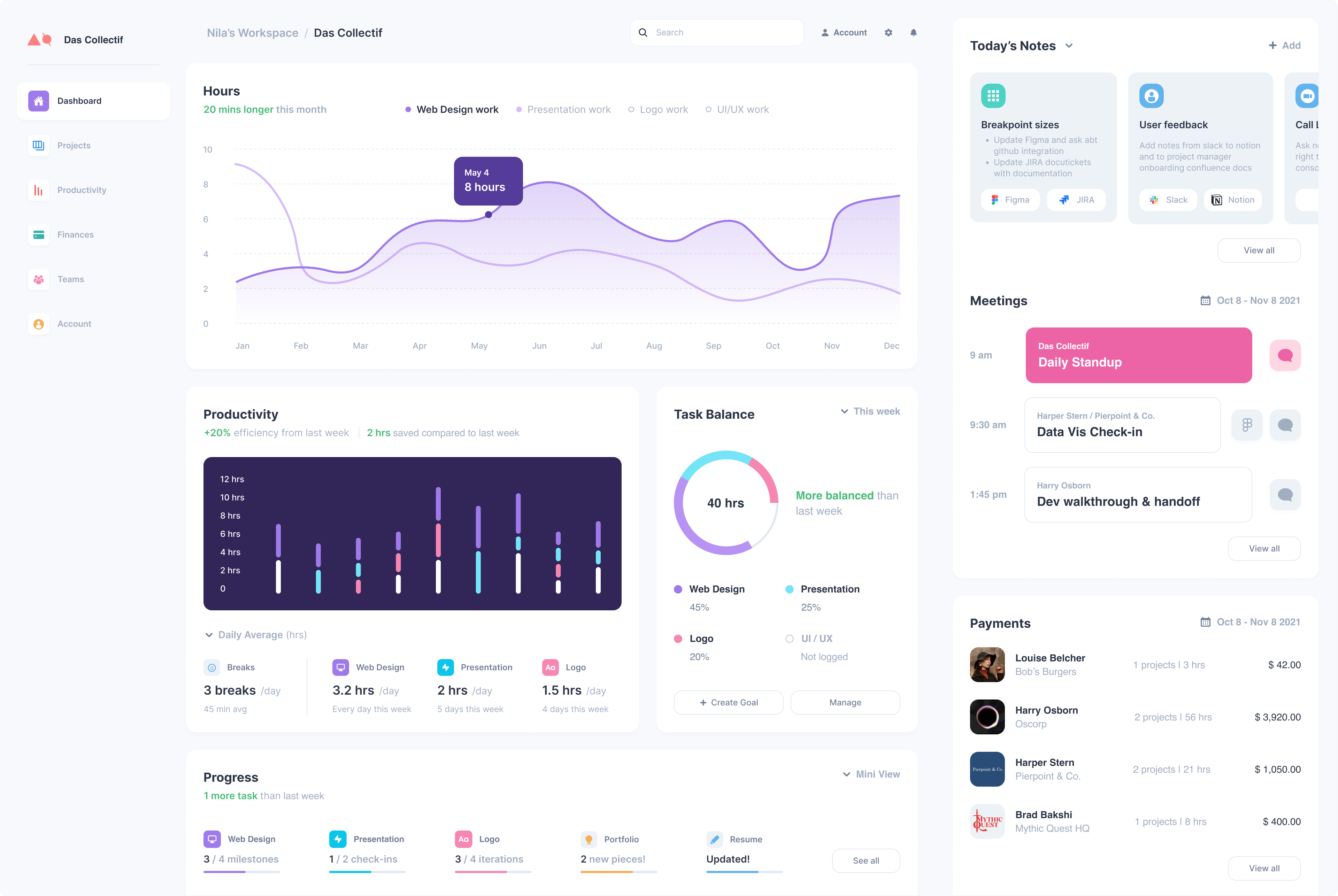
The main dashboard is a customizable overview that quickly assesses how your work is going, what needs to be done, and what's on the agenda for today. Each module has a corresponding page located in the sidebar. They address design work blind spots and grey areas in time management.
I used to agonize over designs that should be quick drafts instead of "perfect," which interfered with deadlines. This dashboard should help manage these issues that fall through the cracks and snowball into stress and inefficient ways of working.
Modules
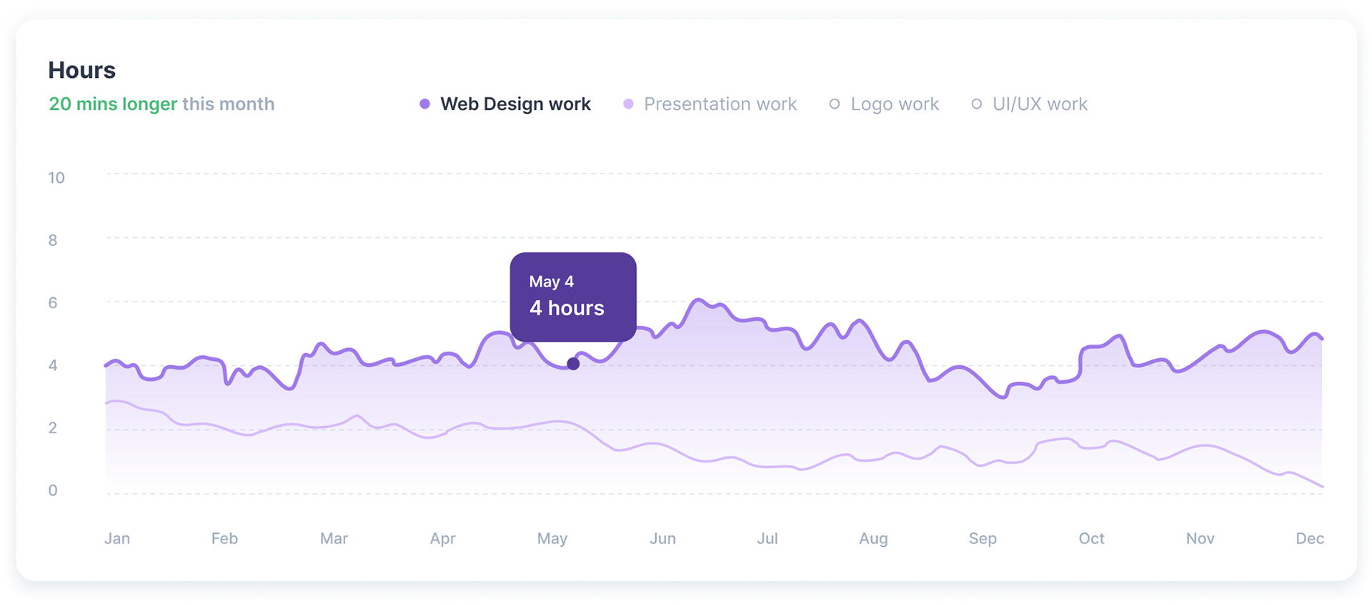
Hours
Compare and contrast hours worked for your most-used design work categories, put a cap on the total number of hours you work each day (10 hours, etc.)
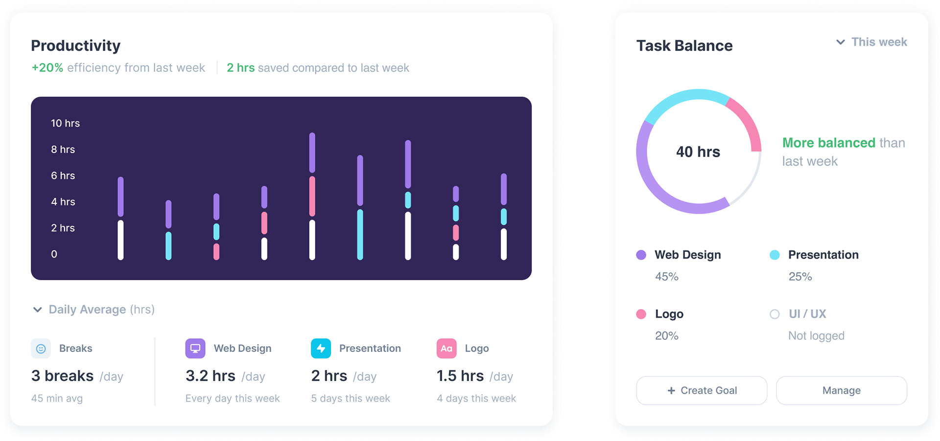
Productivity
Visually assess how long you've worked on projects each day and see if you've been more productive: gauge efficiency, how much time you've saved, and if you took enough breaks to match your goals.
Task Balance
See if you've been balancing your projects according to estimated effort and your goals, e.g., "Spread time out equally among projects" or to "Stop wasting time on projects that should be low effort".
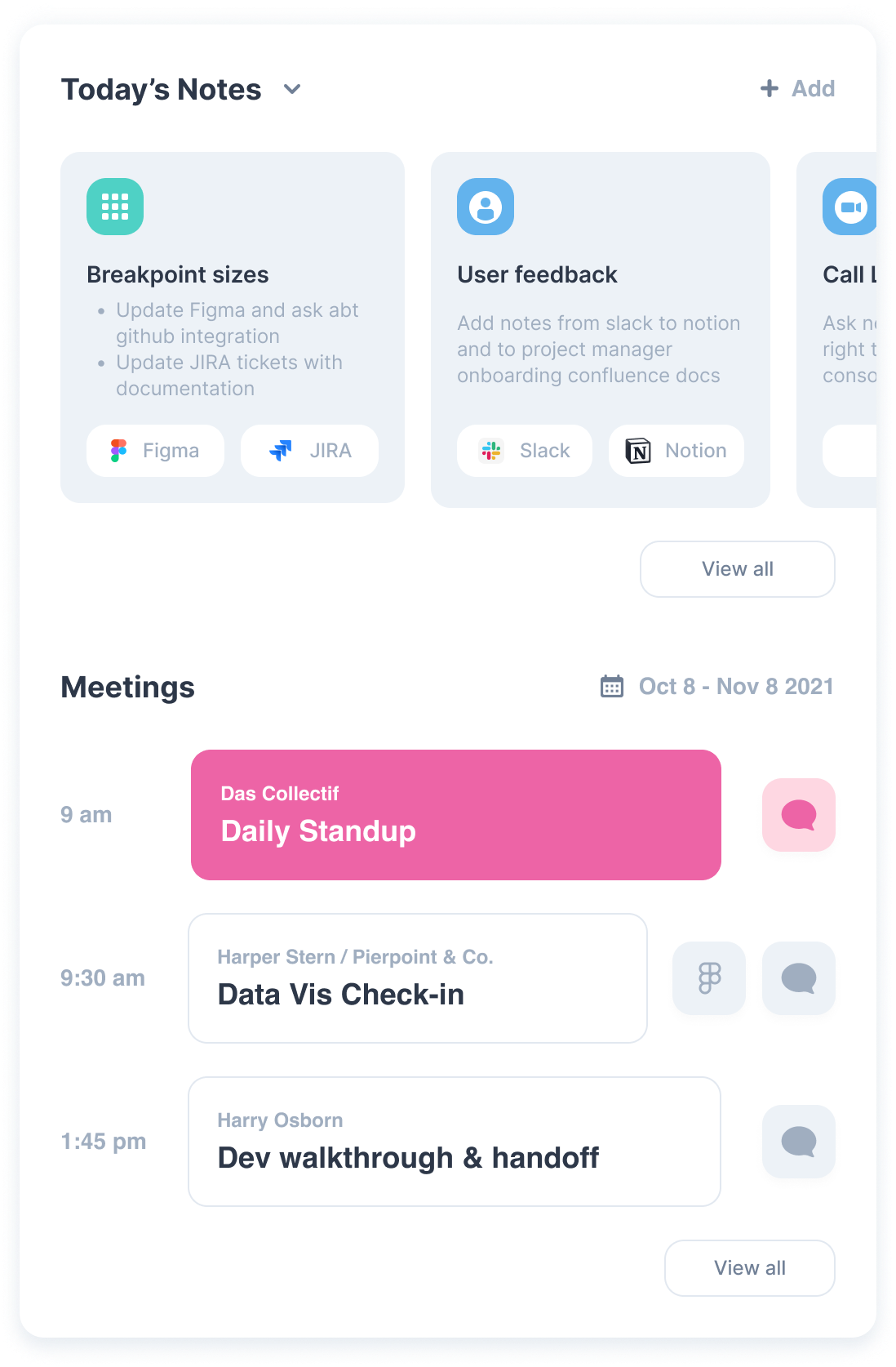
Today
Notes
View sticky notes from yesterday and add more today; each note will detect the mentioned apps or tasks and display editable links to the corresponding apps. Suitable for little insignificant tasks or thoughts that don't belong in other productivity apps.
Meetings
View meetings happening soon; see replies and links attached to the event invitation. Add or view linked files that correspond to the meeting.
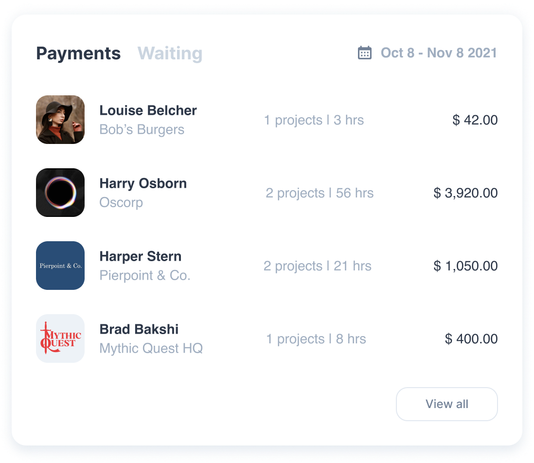
Payments
An overview of recently completed project payments — the client, number of projects, hours worked, and total cost. The "Waiting" tab displays incomplete or overdue payments.